
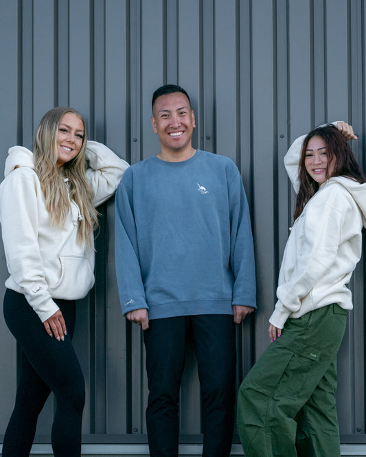
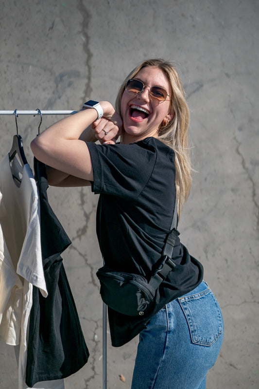
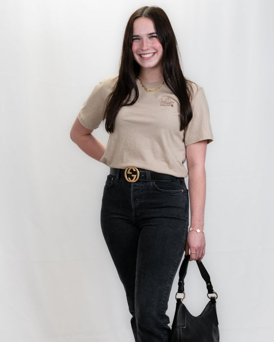
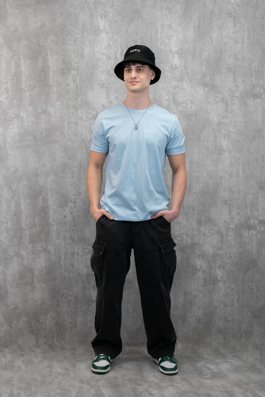
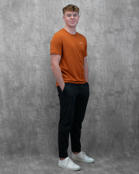
Men's / Unisex Fit Collection:
Men's / Unisex Fit Collection: Timeless Style for Everyone
The Men's / Unisex Fit Collection by LowKure is designed to offer versatile, comfortable, and stylish pieces that suit everyone. With clean lines, neutral tones, and inclusive sizing, this collection reflects the belief that fashion has no boundaries.
Each piece is thoughtfully crafted to ensure a perfect fit for all body types while maintaining a modern aesthetic. Whether you're dressing up or keeping it casual, the Unisex Fit Collection delivers timeless wardrobe staples that seamlessly blend comfort and style.
Celebrate individuality and unity with this inclusive collection, where every design carries the powerful message of LowKure.
-
Explore each product description to discover your unique style and the story behind each piece. Wear with purpose and embrace timeless style.

-
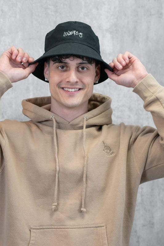
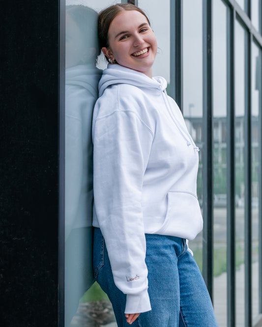
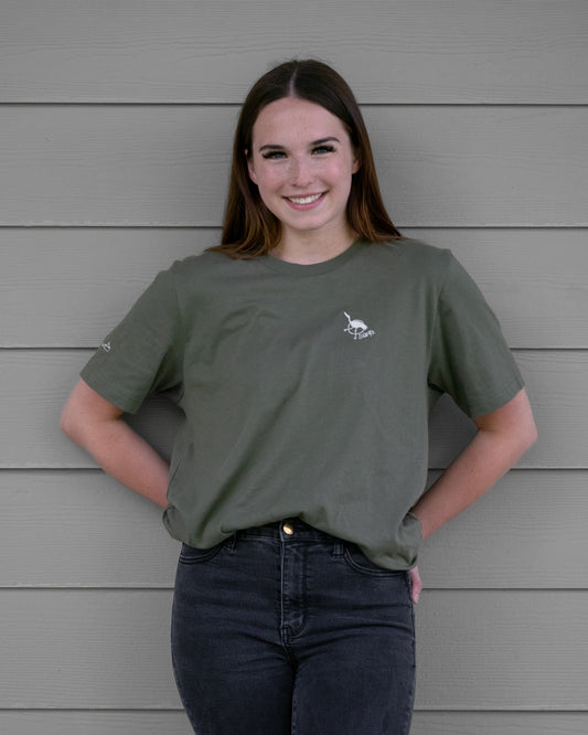
Men's / Unisex Heavyweight Hoodie - SANDSTONE | Crane Logo
Regular price $122.00 CADRegular priceUnit price per -
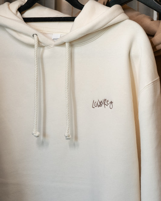
Men's / Unisex Hoodie - BONE | LowKure Tearlight Logo
Regular price $122.00 CADRegular priceUnit price per -
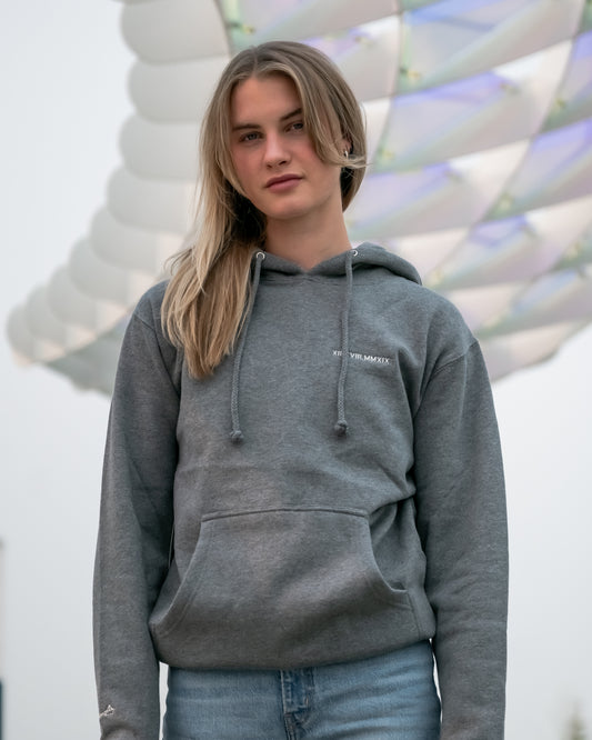
Men's / Unisex Hoodie - HEATHER GREY | XII.XVIII.MMXIX; A Date To Remember Logo
Regular price $122.00 CADRegular priceUnit price per -
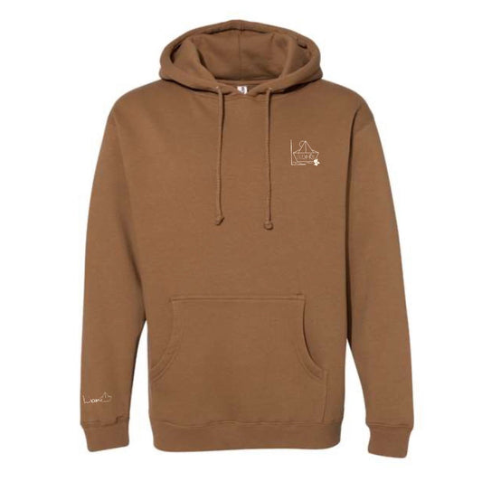
Men's / Unisex Hoodie - SADDLE BROWN | River of Resilience Logo
Regular price $122.00 CADRegular priceUnit price per -
Men's / Unisex Hoodie - WHITE | River of Resilience Logo
Regular price $122.00 CADRegular priceUnit price per -
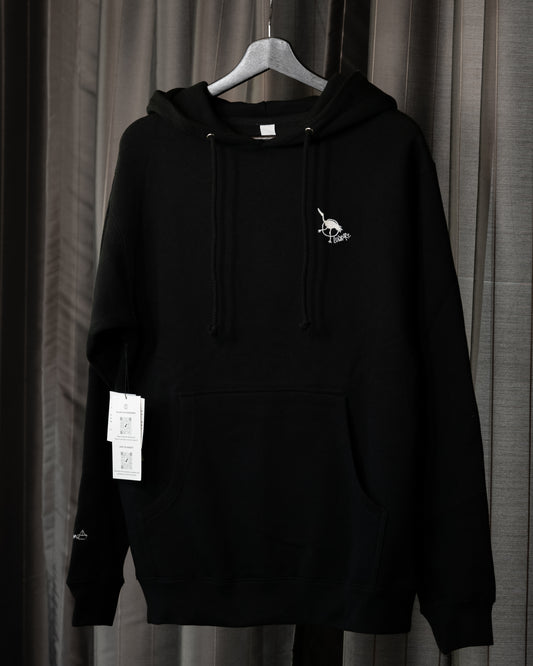
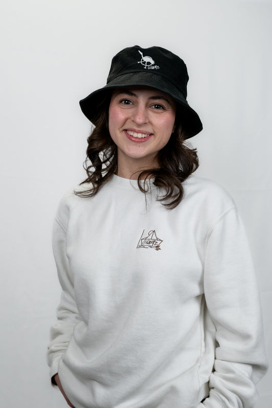
Unisex | The Japanese Crane | Threads of Remembrance Hoodies
Regular price $122.00 CADRegular priceUnit price per -
Men's / Unisex Hoodie - ARMY GREEN | River of Resilience Logo
Regular price $122.00 CADRegular priceUnit price per


Threads of Rememberance | Midweight SWEATSHIRTS
Experience the perfect blend of comfort and versatility with our midweight collection. Lightweight enough for year-round wear yet cozy enough to keep you warm, these pieces are ideal for layering or wearing solo for effortless style.
-
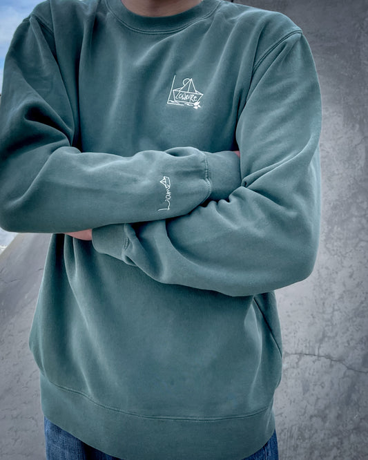
More Than a Best Friend Sweatshirt: Men's / Unisex Vintage Dye Crewneck Sweatshirt - ALPINE GREEN | River of Resilience Logo
Regular price $112.00 CADRegular priceUnit price per -
Men's / Unisex Vintage Dye Crewneck Sweatshirt - BLUE | Crane Logo
Regular price $112.00 CADRegular priceUnit price per -
Men's / Unisex Vintage Dye Crewneck Sweatshirt - WHITE | River of Resilience Logo
Regular price $112.00 CADRegular priceUnit price per -
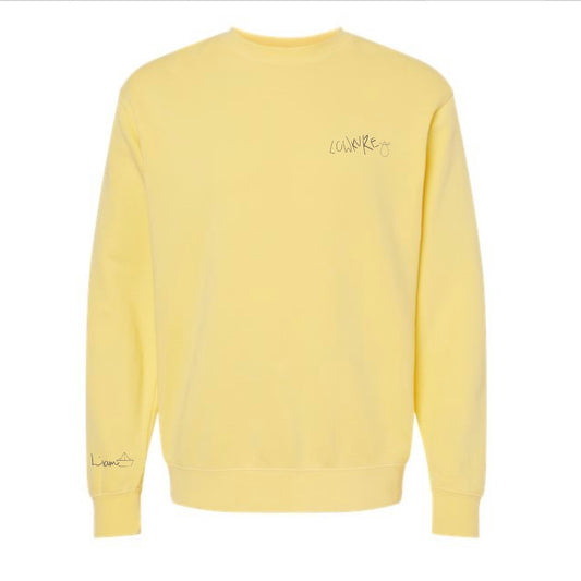
Men's / Unisex Vintage Dye Crewneck Sweatshirt - YELLOW | LowKure Tearlight Logo
Regular price $112.00 CADRegular priceUnit price per -
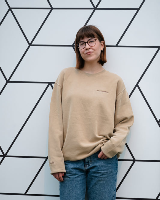
Men's / Unisex Vintage Dye Crewneck Sweatshirt - SANDSTONE | XII.XVIII.MMXIX; A Date to Remember Logo
Regular price $112.00 CADRegular priceUnit price per


-
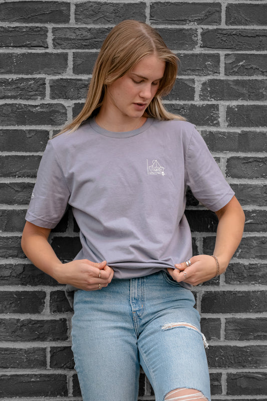
Men's / Unisex Legacy T-Shirt - STORMY | River of Resilience Logo
Regular price $59.99 CADRegular priceUnit price per -
Men's / Unisex Crew Neck T-Shirt - BLACK | Crane Logo
Regular price $59.99 CADRegular priceUnit price per -
Men's / Unisex Legacy T-Shirt - TAN | River of Resilience Logo
Regular price $59.99 CADRegular priceUnit price per -
Men's / Unisex Crew Neck T-Shirt - CHARCOAL GREY | LowKure Tearlight Logo
Regular price $59.99 CADRegular priceUnit price per -
Men's / Unisex Crew Neck T-Shirt - PEBBLE BROWN | XII.XVIII.MMXIX; A Date To Remember Logo
Regular price $59.99 CADRegular priceUnit price per -
Men's / Unisex Crew Neck T-Shirt - LIGHT BLUE | LowKure Tearlight Logo
Regular price $59.99 CADRegular priceUnit price per -
Men's / Unisex Legacy T-Shirt - AUTUMN | LowKure Tearlight Logo
Regular price $59.99 CADRegular priceUnit price per -
Men's / Unisex Legacy T-Shirt - RUST | LowKure Tearlight Logo
Regular price $59.99 CADRegular priceUnit price per -
Men's / Unisex Crew Neck T-Shirt - NAVY | Crane Logo
Regular price $59.99 CADRegular priceUnit price per -
Men's / Unisex Crew Neck T-Shirt - GREY | River of Resilience Logo
Regular price $59.99 CADRegular priceUnit price per -
Men's / Unisex Crew Neck T-Shirt - SOFT CREAM | LowKure Tearlight Logo
Regular price $59.99 CADRegular priceUnit price per -
Men's / Unisex Crew Neck T-Shirt - ARMY GREEN | Crane Logo
Regular price $59.99 CADRegular priceUnit price per


WHAT'S YOUR LowKure?
Choose Your Logo, Wear Your Story.
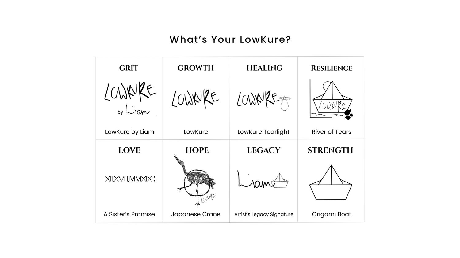
GRIT | LowKure by Liam
The Message Behind Liam's Designs
LowKure Original Logo
LOWKURE: A Clothing Line with a Purpose
The LowKure Original Logo embodies the essence of resilience, healing, and self-discovery. The name "LowKure" is a meaningful combination of "Low" and "Kure," reflecting a profound journey of transformation.
- "Low" represents the struggles we face, particularly low self-esteem, insecurity, and moments of vulnerability. It acknowledges the challenges of feeling stuck in difficult times, honoring the emotional weight many carry.
- "Kure" signifies the pursuit of hope, healing, and growth. It represents the tools, support, and determination to overcome life’s obstacles, fostering a brighter and more empowered future.
The logo incorporates Liam Nishizawa’s original hand-drawn typography, preserving his unique artistic vision and creative spirit. His signature within the design serves as a heartfelt tribute to his legacy, making every detail of the logo deeply personal and significant.
LowKure stands for more than just a brand—it is a movement dedicated to raising awareness about youth mental health and creating a safe space for open dialogue. It serves as a reminder that even in moments of self-doubt and insecurity, there is always a path forward toward healing, confidence, and self-acceptance.
GRIT
This logo is about grit—the quiet strength it takes to keep going through grief, depression, trauma, or anxiety. Grit is getting up when it feels impossible. It’s holding hope when everything hurts. It’s trying again tomorrow.
The inclusion of Liam’s signature adds weight and tenderness—it’s a logo born from both pain and love. It tells the world:
“This mattered to him. This matters to us.”
LowKure by Liam is for those walking through the fire—who choose to carry on, not because it’s easy, but because they know they’re worth the fight. It’s not about perfection.
It’s about perseverance.
GRIT DEFINITION
Grit is the strength of character that allows us to persist through adversity, to keep showing up even when life feels impossible.
It is not about perfection—it’s about perseverance.
MENTAL HEALTH MESSAGE
In the face of anxiety, depression, trauma, or grief, grit looks like getting out of bed when it feels like a mountain. It looks like asking for help, holding onto hope, and trying again tomorrow.
LOGO MEANING
This logo, born from Liam’s art, reminds us that even in pain, we are capable of endurance.
Grit is not the absence of struggle—it’s the courage to keep going through it.
GROWTH | LowKure
The Message Behind The Logo
LowKure | GROWTH
The LowKure logo stands for the quiet power of transformation. It’s not flashy or loud—it’s steady, intentional, and deeply human. “Low” acknowledges the moments when life feels heavy—when we’re stuck in grief, anxiety, insecurity, or uncertainty. “Kure,” with a purposeful “K,” symbolizes the journey back to self—the healing, the tools, the growth we find through reflection and resilience.
This version of the logo represents growth—not as a destination, but as a process. It honours the setbacks, the self-discovery, the therapy, the conversations, and the courage to keep going. Growth is often invisible, quiet, even messy. But it’s there—in every small step forward.
LowKure says:
“I’m not who I once was. I’m still becoming.”
It’s a reminder that healing isn’t linear. But it is possible.
This design is clean, grounded, and universal—representing the evolving story within all of us. It’s for anyone choosing to keep growing, even when it’s hard.
GROWTH
Growth is the process of becoming—not always in a straight line, but in the quiet moments of reflection, resilience, and learning.
MENTAL HEALTH MESSAGE
Healing isn’t linear. Growth happens through setbacks, therapy, support, and self-awareness. It’s the recognition that we are evolving, even when we feel stuck.
LOGO MEANING
This version of the LowKure logo represents transformation. Growth doesn’t erase pain—it gives it purpose. It says: I am not who I was, and I am still becoming.
STRENGTH | The Origami Boat
The Message Behind the Logo
The Origami Boat is more than just a logo—it’s the heart of LowKure’s story and mission.
Navigating Life’s Journey
The boat symbolizes life’s voyage—charting a course through calm seas and stormy waters. It serves as a reminder of resilience and the strength to keep moving forward, no matter the challenges.
Inspired by the Art of Origami
Crafted with simplicity and purpose, the origami design reflects transformation and mindfulness. Just as paper is folded into something beautiful and strong, the human spirit has the power to shape itself through perseverance.
A Tribute to Liam’s Vision
This timeless design honors Liam Nishizawa’s creativity and passion. The boat stands as a beacon of hope, carrying his dream of spreading mental health awareness and inspiring others to embrace their struggles with courage.
Timeless Elegance, Universal Meaning
With its minimalistic lines and thoughtful design, the Origami Boat is a universal symbol of adaptability, growth, and the belief in brighter days ahead.
Wear the Origami Boat as a symbol of strength and hope, and join LowKure’s mission to navigate life’s waves together.
STRENGTH
Strength is not always loud—it can be soft, delicate, and still powerful. Like paper folded into something that floats, it’s the quiet fortitude to carry on.
MENTAL HEALTH MESSAGE
Strength is vulnerability, boundaries, showing up to therapy, asking for help, holding space for others, and learning to rest.
LOGO MEANING
The origami boat floats even when it’s fragile. This logo reminds us that strength doesn’t mean never breaking—it means learning how to stay afloat in the storms.
LOVE | XII.XVIII.MMXIX; A Sister's Promise
The Message Behind the Logo
The Sister’s Promise – Discovering LowKure
The Sister’s Promise logo is a deeply symbolic tribute, representing the unbreakable bond between siblings and the commitment to carrying forward a loved one’s legacy. Originally designed by Kaylee as she turned her pain into purpose, this date holds profound meaning—it marks the beginning of a journey to honour Liam’s life through action, resilience, and advocacy.
Following Liam’s passing, his volleyball coach and team created a tribute clothing piece in his honour. Inspired by the impact of that piece, Kaylee set out to create a mental health clothing line to keep Liam’s memory alive. Three years later, in a powerful and unexpected discovery, she learned that Liam himself had designed a mental health brand called LowKure with one of his best friends - Clarice. In a beautiful coincidence, two worlds collided, and LowKure was born—blending Liam’s vision with Kaylee’s mission.
A Date to Remember — XII.XVIII.MMXIX;
At the heart of this tribute is the Roman numeral logo: XII.XVIII.MMXIX.
This date, December 18, 2019, marks the day the world lost an extraordinary, compassionate, and beautiful soul. It is a solemn reminder of Liam’s impact, his kindness, and the lives he touched. Paired with a semicolon (;), a universal symbol of strength and resilience, this design represents a continuation of life, even through the darkest storms. It is a tribute to enduring love, hope, and the courage to carry on.
More than just a logo, The Sister’s Promise is a universal symbol of remembrance, love, and unwavering devotion to those we’ve lost. It stands as a beacon of strength, a reminder that even in grief, we have the power to turn pain into purpose.
LOVE
Love is the bond that transcends time, space, and even death. It is the force that creates, protects, and remembers.
MENTAL HEALTH MESSAGE
When mental health is challenged, love shows up as compassion—for others and for ourselves.
It’s connection, loyalty, presence, and the sacred act of staying.
LOGO MEANING
This logo is Kaylee’s vow to her brother: to turn heartbreak into hope.
Love doesn’t disappear—it becomes a legacy of advocacy, care, and unbreakable promise.
HEALING | LowKure TearLight
The Message Behind The Logo
LowKure TearLight
The TearLight Logo is a powerful emblem of resilience, hope, and the transformative journey from struggle to strength. Designed with deep intention, it features a teardrop encircled by a radiant halo, each element carrying profound symbolism:
The Tear:
Representing personal struggles, challenges, and moments of vulnerability, the tear reflects the emotional weight we all carry at times. It is a universal symbol of human experience, reminding us that it is through these moments of pain and reflection that growth begins.
The Halo:
Surrounding the tear is a glowing halo, embodying light, hope, and the strength that overcomes adversity. It represents the guiding force of resilience, the inner power that transforms struggles into wisdom, and darkness into light.
Together, the tear and halo form the TearLight Logo:
A poetic visual narrative of life's balance—the interplay between hardship and healing. It serves as a reminder that every challenge carries the potential for light, and every tear can lead to clarity and strength.
This logo is more than an image; it is a tribute to the journey of overcoming, to finding beauty in imperfection, and to embracing the light within.
HEALING
Healing is the act of reclaiming your wholeness. It’s soft, slow, sacred work that honours every wound and every breakthrough.
MENTAL HEALTH MESSAGE
Healing looks like breathing through panic, finding safety in your body, reconnecting with your story, and discovering that brokenness doesn’t mean unworthy.
LOGO MEANING
This soft variation of the LowKure design speaks to tenderness. Healing is allowed to be gentle. It’s a light that begins to rise again, even in darkness.
HOPE | The Japanese Crane
The Japanese Crane
The Japanese Crane Logo represents strength, healing, and the enduring hope to overcome life’s challenges. Rooted in Liam’s Japanese heritage, the crane is a powerful cultural symbol in Japan, representing longevity, good fortune, and resilience.
The legend of the 1,000 paper cranes, or senbazuru, says that if someone folds 1,000 origami cranes, their heartfelt wish will come true. The cranes have come to symbolize hope and healing, a meaning best known through the story of Sadako Sasaki, a young girl who folded cranes in her final days, wishing for both personal recovery and peace in the world. Today, the tradition continues, with communities folding 1,000 cranes for those facing serious illness, embodying collective support and the hope for recovery.
For Liam, this tradition became deeply personal when his brother fell gravely ill. Their Japanese school community came together to fold 1,000 paper cranes for his brother, offering their hope and prayers for his recovery. When his brother made a full recovery, the crane became an enduring symbol of resilience and the strength found in unity for Liam.
Adapted from Liam’s original hand-drawn sketch, the Japanese Crane Logo is now a cornerstone of Lowkure’s identity. It reminds us of the power of collective support, the resilience to rise through life’s challenges, and the hope that healing—both personal and collective—is always possible.
HOPE
Hope is the belief in something beyond the present pain. It’s fragile but powerful—an ember in the ashes that says “not yet done.”
MENTAL HEALTH MESSAGE
Hope may look like a single good moment in a hard day, a safe person, a glimmer of light. It’s choosing to stay, to try, to believe in tomorrow.
LOGO MEANING
The crane, in Japanese culture, symbolizes healing and peace. This logo invites us to fold hope into our lives, one corner at a time, until it takes flight.
RESILIENCE | The River of Tears
The Message Behind The Logo
The River of Tears: A Symbol of Resilience
The heart of LowKure is captured in a deeply symbolic image: a delicate paper origami boat sailing on a river of tears. This boat, fragile yet afloat, represents resilience amidst life’s struggles.
On the left stands a bold “L,” a tribute to Liam, while the “C” of the sun honors Clarice, shining light and warmth on the journey. The boat sails on waters created by three tears in the bottom right, each one a reflection of Liam’s abundant emotions. These tears, flowing from sorrow and vulnerability, form the river that the origami boat will forever float upon—transforming pain into purpose and fragility into strength.
This logo also sheds light on the dual reality of mental health: a delicate blend of hope and depression. It acknowledges that struggles can coexist with optimism, and that healing is not a straight path but a complex journey. The River of Tears is an emblem of honesty, encouraging us to be open about how we are truly feeling—whether that means expressing hope, sorrow, or a mix of both.
Together, these elements weave a narrative of friendship, loss, and healing. The River of Tears reminds us that even in our most vulnerable moments, we can find strength, create meaning, and chart a path forward.
RESLIENCE
Resilience is the ability to hold sorrow without letting it drown you.
It’s not about avoiding tears—it’s about letting them flow, and still choosing life.
MENTAL HEALTH MESSAGE
Resilience isn’t the absence of crying; it’s the return after collapse. It’s building strength from the storms.
LOGO MEANING
This logo reminds us that tears are sacred, and they carve out rivers that carry us forward. You are not weak for feeling deeply—you are resilient for continuing to rise.
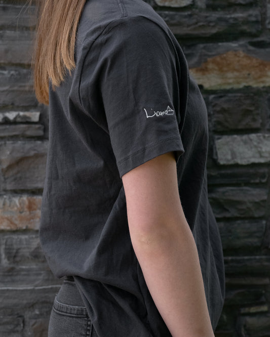
LEGACY | The Artist's Signature Legacy
Artist's Signature Legacy
Remembering Liam Nishizawa
Liam was a remarkable individual—compassionate, empathetic, intelligent, hilarious, and endlessly artistic. His creativity and personality left a lasting impression on everyone who knew him.
One of Liam’s unique traits was his incredibly neat handwriting, something he was known for from a young age. This design, taken directly from his grade 9 social studies test, showcases his true, everyday handwriting—the way he wrote his name.
This tribute serves as a lasting reminder of Liam’s impact: his kindness, his talent, and the joy he brought to those around him. Through this design, Liam’s legacy lives on, inspiring strength, creativity, and connection in all who carry it forward.
LEGACY
Legacy is what remains when we’re gone—the imprint of our soul in the lives we’ve touched and the love we leave behind.
MENTAL HEALTH MESSAGE
For those we’ve lost to suicide, their legacy can become our mission. Grief becomes a canvas. Advocacy becomes a monument.
LOGO MEANING
This logo is Liam’s signature—his artistic fingerprint. His life, creativity, and voice live on in every piece of LowKure.This is legacy: art turned into purpose.
